

How to Use Pantone’s Color(s) of the Year to Increase Your Bottom Line

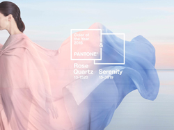
For the first time, the blending of two shades—Serenity and Rose Quartz—are chosen as the Pantone Color of the Year.
Pantone’s color of the year can be a good barometer for fashion industry color trends. Last week, Pantone’s color experts made their big announcement for 2016, but the reveal came with a twist. For the first time ever, it’s a blend of two colors: PANTONE 15-3919 Serenity and PANTONE 13-1520 Rose Quartz. As Pantone described in a recent release, Serenity and Rose Quartz are “a harmonious paring of inviting shades that embody a mindset of tranquility and inner peace.”
The 2016 color(s) of the year are a departure from 2015’s Marsala, and the previous five years’ brighter selections (Turquoise, Honeysuckle, Tangerine Tango, Emerald and Radiant Orchid.)
The decision was made in response to the daily stresses of modern-day living. The color(s), Pantone argued, gives a sense of reassurance and security—something that consumers crave during times of uncertainty. The release went on to describe Serenity as “weightless and airy, like the expanse of the blue sky above us,” while Rose Quartz is a “persuasive yet gentle tone that conveys compassion and a sense of composure.”
“With the whole greater than its individual parts, joined together Serenity and Rose Quartz demonstrate an inherent balance between a warmer, embracing rose tone and the cooler, tranquil blue, reflecting connection and wellness, as well as a soothing sense of order and peace,” said Leatrice Eiseman, executive director of the Pantone Color Institute.
Pantone’s decision was also motivated by the ongoing gender blur in the fashion world. “In many parts of the world we are experiencing a gender blur as it relates to fashion, which has in turn impacted color trends throughout all other areas of design,” Eiseman added. “This more unilateral approach to color is coinciding with societal movements toward gender equality and fluidity; the consumers’ increased comfort with using color as a form of expression, which includes a generation that has less concern about being typecast or judged; and an open exchange of digital information that has opened our eyes to different approaches to color usage.”
As packaging becomes more synonymous with lifestyle color trends, print resellers can expect to see Serenity and Rose Quartz gain ground in this sector. Pantone pointed to food and beverage packaging and cosmetics and accessories packaging as examples.
How can Serenity and Rose Quartz translate to success in other promotional goods? Kitchen items and tableware are a good place to start. Pantone recommended using Serenity and Rose Quartz-inspired home accessories, like candles, decorative bowls, vases and florals, to accent rooms.
And one can never go wrong with jewelry. A quick inquiry for “Rose Quartz” on Promo Marketing’s product search (also available on Print+Promo's website) yielded several results, including this Pink Rose Quartz Bracelet from The Premium Line:

Happy Selling!
 How to Build Customer Trust and Get Referrals
 ASB Sales Associate Kevin Becker Achieves Record Year
 FONO (Muzzillo Dictionary of Terms)
 Executive Perspectives: Ross Silverstein of iPROMOTEu
 Orbus Releases 2023 Editions of Exhibitors’ Handbook and Promo Handbook Catalogs
 The Magnet Group Announces Two Promotions to Sales Team