

Can Pantone’s Color of the Year Heal a Divided Nation?

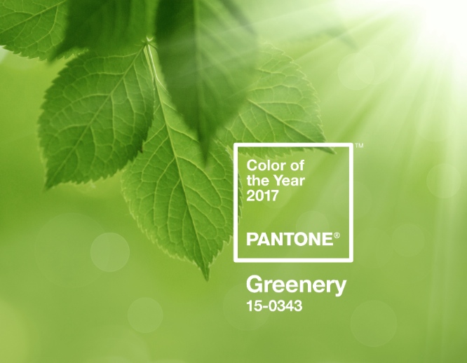 For many Americans, the future raises some unsettling questions—mostly surrounding the incoming presidential administration. The team at the Pantone Color Institute took this into account when choosing its 2017 Color of the Year: PANTONE 15-0343 Greenery.
“We know what kind of world we are living in: one that is very stressful and very tense,“ Pantone Color Institute Executive Director Leatrice Eiseman told The New York Times in a recent interview. “This is the color of hopefulness, and of our connection to nature. It speaks to what we call the ‘re’ words: regenerate, refresh, revitalize, renew. Every spring we enter a new cycle and new shoots come from the ground. It is something life affirming to look forward to.”
Described as “fresh” and “zesty,” the light-yellow green hue symbolizes the pursuit of personal passions. While last year’s choice blended two shades, Serenity and Rose Quartz, as a way to not only promote tranquility and inner peace, but to represent an ongoing gender blur in the fashion world, Greenery “bursts forth in 2017 to provide us with the hope we collectively yearn for amid a complex social and political landscape,” Eiseman said in a press release.
Designers of printed products might also find inspiration from this color of “freshness.” As the release pointed out:
Because of green’s prevalence in nature, it maintains a perception of being inherently good for you and organic. People respond on a visceral level to the hue, making the eye-catching Greenery an ideal shade for many applications of graphic design. This is especially true for packaging, where the sight of Greenery provides an instant message of freshness.
Click on the video below to see Greenery in action.
What do you think of Pantone’s selection? Sound off in the comments section.
- People:
- Leatrice Eiseman
 A Guide to Hiring the Right Designer for Your Print Shop
 How Hot Dog Promos Create Opportunities for Creative Apparel, Packaging
 Pantone Reveals Its 2023 Color of the Year
 Heinz Added Real Ketchup Stains to Branded Apparel 'Drop'
 What You Need to Know to Get Your Clients' Packaging Noticed
 Jack Nadel International Rebrands as ‘Nadel’